EVENTUAL · 2026

ROLE
Product Designer
TIMELINE
Apr 2026 – May 2026
TEAM
Product Designer
Project Manager
CTO
CEO
TOOLS
Figma
Cursor
After Effects
OVERVIEW
Users knew what they needed, but the challenge was explaining how we delivered it.
Users wanted closer thresholds instead of waiting the full three years for a payout. We created Relative Pricing to solve that, but it came across complicated. We needed to explain a complex solution like it was simple.
SOLUTION
A workflow that energized agents with the confidence to present the new approach.
IMPACT
77%
adoption among quotes created post-launch.
12
days from concept to production by using AI for prototyping.
1/2
of the flow shipped with minimal engineering input.
EARLY FINDINGS
Users needed to see the difference, not just read about it.
We'd already proven that interactive visuals worked for Fixed pricing. So we applied the same logic to help users compare Fixed vs Relative.
PAIN POINTS
A three-year payout threshold felt too far away for homeowners to commit to.
Pricing model was hard to explain without visual references.
Agents needed a way to show homeowners how year-by-year thresholds worked.
A NEW WORKFLOW
How can we introduce a new key feature in less than 2 weeks?
We needed to ship fast. Instead of traditional handoffs, we worked in parallel. Engineering built the backend, I built the frontend in code. We reviewed together at the end instead of blocking each other.
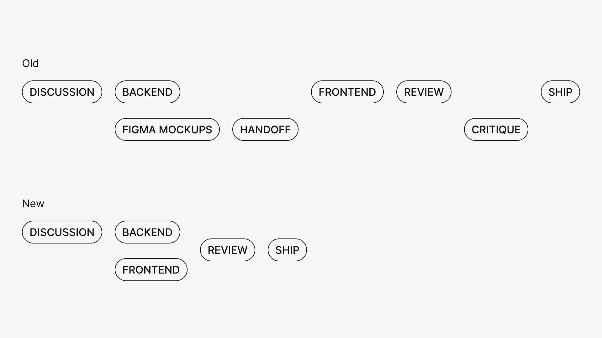
Pixel Perfection Doesn't Require Traditional Handoffs
Working in the same codebase eliminated the annotation back and forth. No UI handoff meant no delays, I could build every interaction state and edge case exactly as needed, saving the team hours and sometimes days.
DESIGN PROCESS
Blending Figma and Cursor to streamline the design process.
Since this screen was already built and in our Figma, it was easy to jump right in the codebase and get to work without needing to create new components.

FEATURES
Segmented Control
We wanted to continue to use our segmented options to stay consistent with the rest of the page, but we also needed to have the new relative option standout. The 'New' badge helps break up the subconscious navigation and ideally prompts the user to look into the new feature.
I chose to keep the 'Fixed' threshold as the default selection even though we wanted mass adoption on the new feature, because if we make it the default and people are aimlessly clicking through it could lead to errors down the line that the user never knew they made.

Modal
Initially the idea was to have this compare options visualization live inside a tooltip but I ended up moving it over to a modal instead. But why would we choose the modal instead of tooltip?
Cognitive focus - Comparing the two pricing models requires the users full attention. Keeping it as a tooltip would split the focus between the comparison and the rest of the UI, but utilizing a modal eliminates distractions.
Intentional friction - By blocking the flow momentarily, we can signal to users the importance of the comparison.

Summary Card
The summary card dynamically shows the payout threshold as a dollar amount or percentage based on the user's choice. For Relative pricing, displaying '+10%' works but could be clearer. In the next iteration, I'd change it to '10% above annual premium' so the logic is immediately visible without needing to cross-reference the comparison modal.

FEEDBACK
