Work
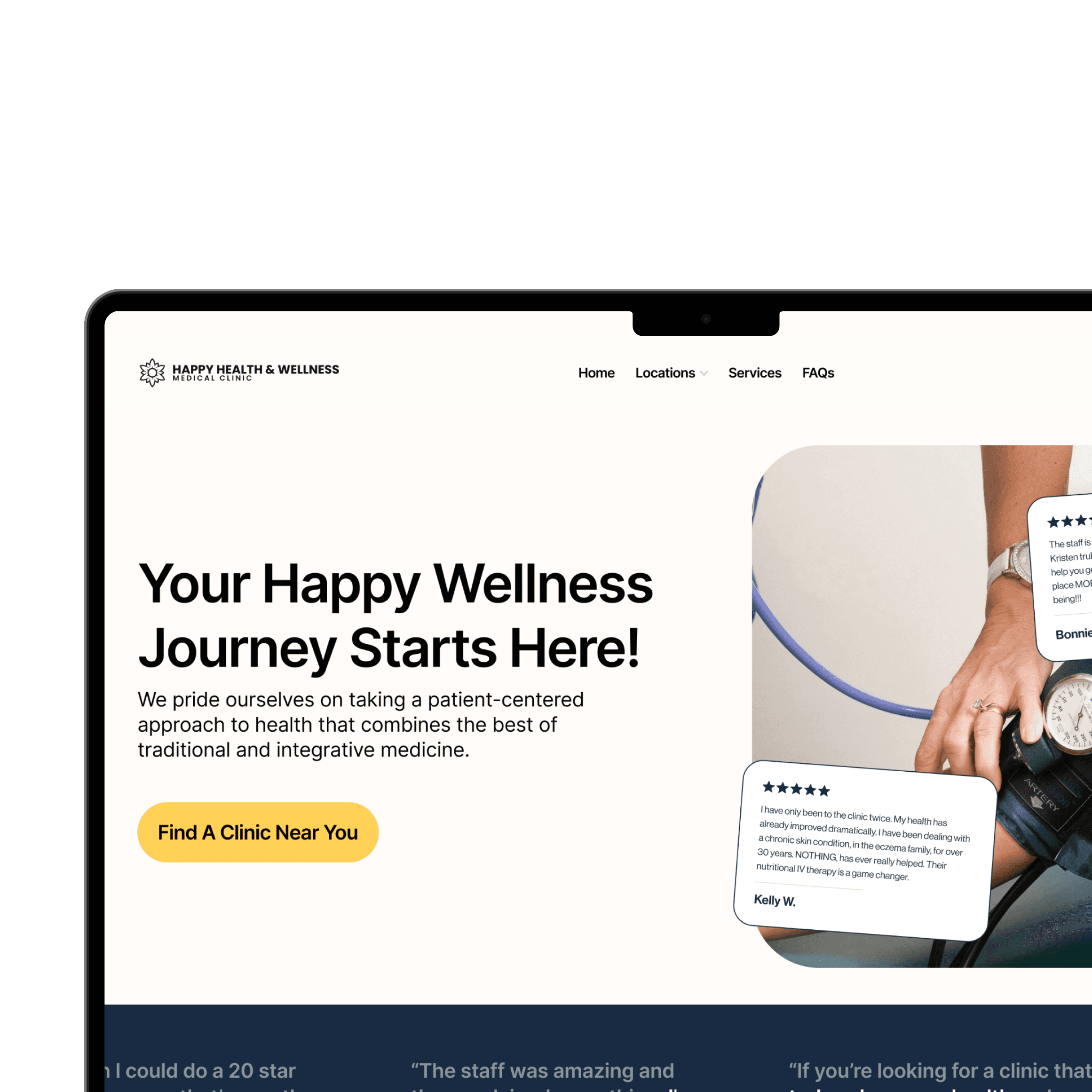
Redesigning Happy Health & Wellness' Homepage
The current website was hard to understand what it is we do, where to go for new patients, and didn't follow WGAC guidelines. The goal was to streamline all user tasks to 3 clicks.
Problems and Opportunities


Confusing Flow
Clutter caused patients, new and returning, to get lost and frustrated. The goal was to make it easier to request an appointment in just 3 clicks.

Lack of Mobile Optimization
80% of the visitors to our website were coming from mobile, yet the mobile site was broken on multiple pages - losing trust with non-tech savvy users.
Solutions

Updated Design System
Introduced new colors to improve WCAG requirements, as well as allow for a brighter and more inviting starting point.

Simple, Clear Hierarchy
Legibility for older users is much better with dark text on a white backrgound, so I got rid of text ontop of images. There's now two clear CTAs, one for new users to find a clinic in their area, and one to request an appointment for existing patients.

Explanation Through Imagery
Replaced generic "health" stock images, with pictures directly showing the type of preventative care provided.

Information First
Interactive maps, phone number, email and other useful information was made front and center for every location's landing page
Results
8.8% increase in appointment requests
Decreased load time from 7.2s to 2.3s
Decreased bounce rate by 9.5%
Increased WCAG accessibility rating from 1.83 to 14.21